Stewardship · The Cotswolds
Cotswold colour, soft texture, and how a stone house becomes home
How to dress a Cotswold house so it feels lived in: honey stone and chalk whites, the Daylesford look, linen and wool, The White Company, Farrow & Ball, Neptune, and the textures that belong here.
Janette Purkiss · 19 September 2026

A Cotswold house already arrives with a palette. Honey limestone, a roof the colour of wet slate after rain, a garden that goes from acid green in May to the dry gold of August. The mistake is to fight that with a look copied from a London loft or a coastal rental: cool grey walls, chrome everywhere, a sofa that could belong to anyone. Homely here means something else. It means the room still smells faintly of woodsmoke and beeswax. It means you want to take your shoes off.
This is not a shopping list disguised as taste. It is how we think about colour, texture and a handful of brands when we ready a house to be lived in — or hosted — around Kingham, Daylesford and the villages that share that light.
Start with the stone, not the swatch
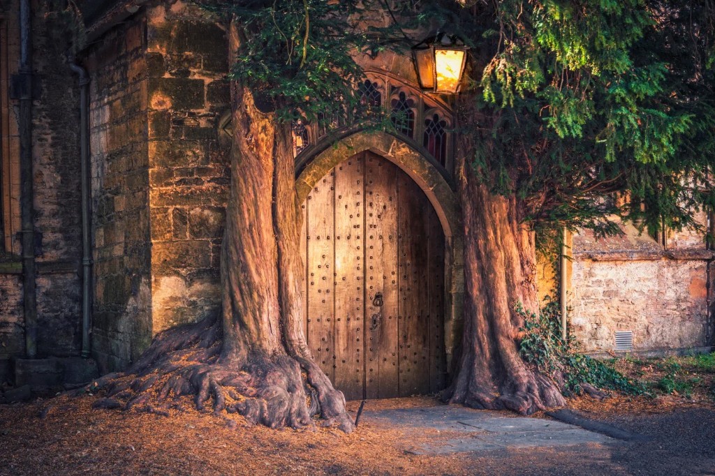
Cotswold stone is not one colour. Near Daylesford and Kingham it runs warm — butter, biscuit, the soft gold of late afternoon. Further west, or in a shadier lane, it can read cooler, almost grey-green. Hold a pure brilliant white next to it and the wall looks dirty. Hold a chalky bone white — Farrow & Ball's Wimborne White, Strong White, or Little Greene's Slaked Lime — and suddenly the stone looks expensive again. That is the whole game: choose paints with a warm or mineral undertone so the limestone remains the lead actor.
Greens belong here in a way they do not in a white cube. Sage, olive, a soft moss on a kitchen dresser or a boot-room door. Dusty pinks and terracotta on a chimney breast, not on every wall. Deep charcoal or inky blue for a front door that photographs well in October light. One confident colour per room is usually enough. The stone is already doing the rest.
The Daylesford look, taken home
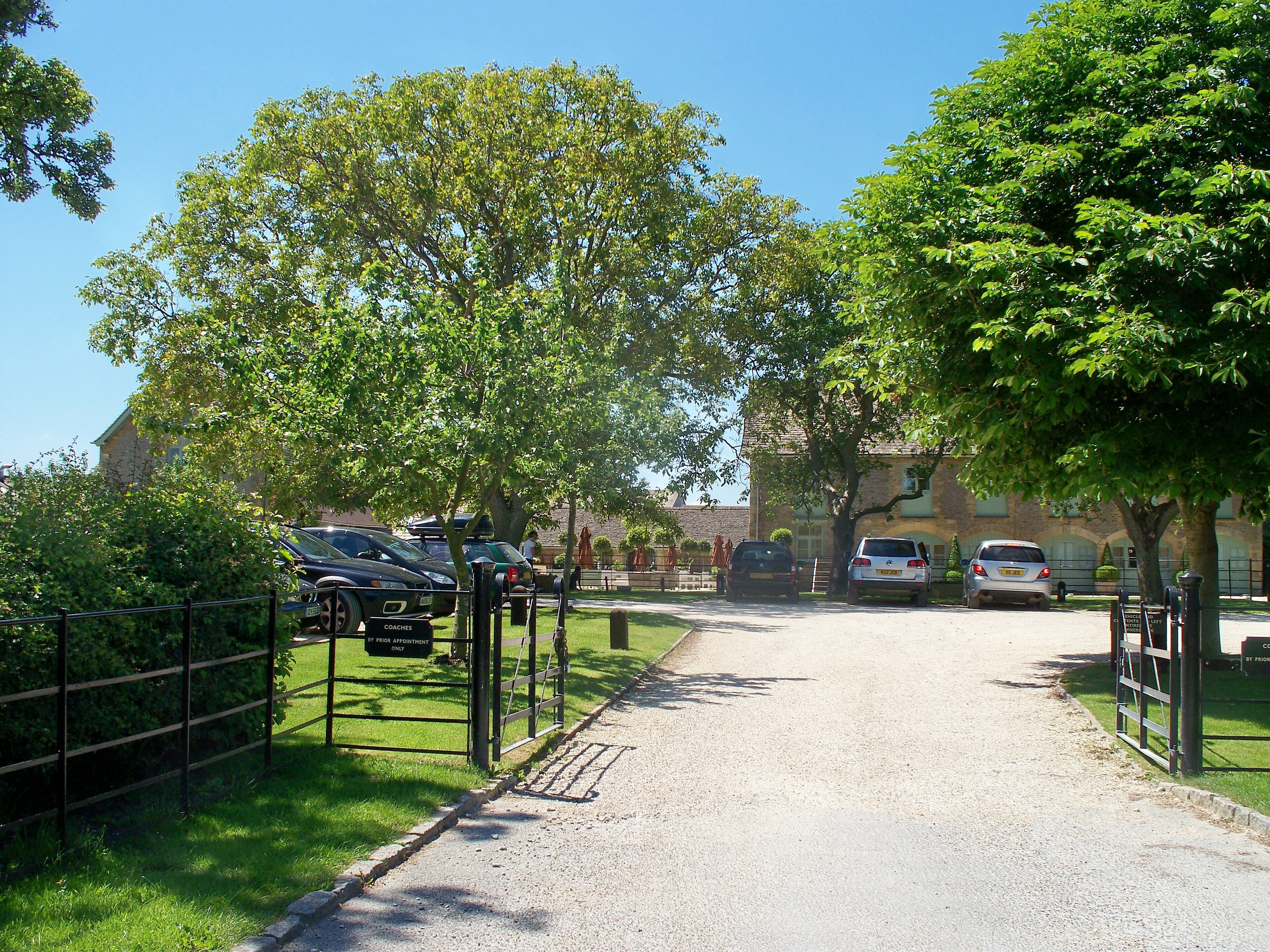
People say 'the Daylesford look' and mean a dozen things: the farm shop, the café tables, the linen napkins, the sense that rural life can be both muddy and immaculate. At home, the useful part is the discipline. Natural materials. Calm surfaces. Food that looks like someone cooked it. A jug of something green on the table. Nothing branded so loudly that the house becomes a showroom.
If you live near Life in Kingham, you already have the reference in walking distance. Notice what Daylesford does with oak, with stoneware, with pale walls and dark metal. Then do less of it at home, not more. A Cotswold kitchen should forgive a dog bowl and a school bag. Farm-shop polish without the theatre is the point.
Texture is what makes it homely
Colour gets the Instagram credit. Texture is what you feel at six in the evening. Linen that wrinkles. Wool throws with a bit of weight. A rush or seagrass rug that sounds soft underfoot. Oak that has been oiled, not lacquered into plastic. Limewash or a chalky emulsion that catches the light unevenly. Curtains that puddle a little. These are the differences between a house that looks finished and a house that invites a second cup of tea.
Avoid the smooth everything look: high-gloss cabinets, mirrored surfaces, fabrics that bounce light like a hotel corridor. Old stone wants companions with grain — timber, clay, linen, iron, a bit of worn leather. Mix generations. A new Neptune table can sit under a inherited Welsh dresser. A contemporary sofa in a deep olive can face a fireplace that has not been fashionable since 1720. Homely is the conversation between them.
Brands that belong — and how not to collect them
The White Company earns its place for a reason: bedding, towels, the soft white layer that makes a guest room feel considered without shouting. Pair it with a quilt that has actual pattern, or a local antique blanket, so the room does not become a catalogue page. Farrow & Ball and Little Greene remain the reliable paint houses for Cotswold light — depth in the pigment, names that sound like places. Neptune for kitchens and furniture that can take a decade of Sunday lunches. Daylesford Home for the ceramics and candles you will actually use. Toast, Rowen & Wren, or similar for textiles with honesty.
What does not belong: a room where every object still has a brand story attached. Buy the mattress and the paint from people who know their craft. Fill the shelves from markets, from Moreton on a Tuesday, from the house you already owned. Guests remember the feel of the sheets and the smell of the fire. They do not need a full roll-call of labels.
Lived in, not staged

If the house will also host — short stays, family weeks, the Christmas that fills every bed — resist the temptation to strip personality for 'broad appeal'. Broad appeal is beige. Narrow, honest appeal is why people rebook: a proper armchair by the window, books that look read, a kitchen that works for a roast, not only for photographs. We dress houses for how January feels, not only how August photographs.
Edit hard. One good lamp beats three matching ones. A single painting with weight beats a gallery wall of fillers. Leave a little empty wall so the stone can breathe. And if you are buying in the Cotswolds and the survey is still ahead of you, remember: interiors are the easy romance. Fabric is the work. Colour and texture are how you celebrate the fabric once it is sound.
When you want a house that already understands this — or one that can be brought gently into it — write. We acquire and manage places where the stone, the linen and the kettle all seem to know each other.
- What colours work best in a Cotswold stone house?
- Soft chalk and bone whites, warm greige, olive and sage greens, dusty pinks, and the occasional deep inky blue or charcoal for a door or chimney breast. Match the undertone of your stone — honey, cream, or grey — before you buy a tin.
- What is the Daylesford look at home?
- Calm rooms, natural materials, farm-table practicality, and a quiet polish: linen, oak, stoneware, herbs on the sill, nothing shouting. It is farm shop elegance, not country kitsch.
- Which brands suit a Cotswold cottage interior?
- The White Company for bedding and soft whites; Farrow & Ball or Little Greene for paint with depth; Neptune for kitchen and furniture that ages; Daylesford Home for tableware; Toast and similar for textiles with grain. Buy fewer, better pieces.